## Create First Tkinter GUI Application
There are two main methods used which user needs to remember while creating the Python application with GUI. These methods are:
### 1. Tk()
In Tkinter, the Tk() class is used to create the main application window. Every Tkinter program starts by creating exactly one Tk() object. Below is the syntax:
> root = Tk(screenName=None, baseName=None, className='Tk', useTk=1)
****Parameter:****
- ****screenName (optional):**** Specifies the display (mainly used on Unix systems with multiple screens).
- ****baseName (optional):**** Sets the base name for the application (default is the script name).
- ****className (optional):**** Defines the name of the window class (used for styling and window manager settings).
- ****useTk (optional):**** A boolean that tells whether to initialize the Tk subsystem (usually left as default 1).
### 2. mainloop()
The mainloop() method starts the event loop of a Tkinter application. It keeps the window open, waits for user actions (like mouse clicks or key presses), and processes events until the window is closed. Below is the syntax:
> root.mainloop()
****Example:**** This example creates a basic Tkinter window and starts the event loop.
`import tkinter as tk root = tk.Tk() # Widgets are added here root.mainloop()`
****Output****
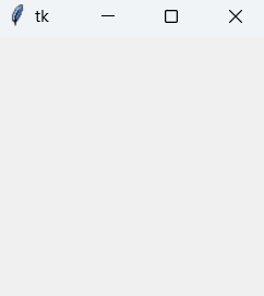
****Explanation:****
- tk.Tk(): Creates the main application window.
- root.mainloop(): Starts the event loop and keeps the window responsive.
- The program stops only when the window is closed.
## Tkinter Widget
There are a number of [tkinter widgets](https://www.geeksforgeeks.org/python/what-are-widgets-in-tkinter/) which we can put in our tkinter application. Some of the major widgets are explained below:
### 1. Label
The Label widget is used to display text or images in a Tkinter window. It is commonly used for showing messages, titles, or instructions. Below is the syntax:
> label = tk.Label(master, option=value)
****Parameter:**** ****master**** refers to the parent window or container in which the label is placed.
****Example:**** This example creates a simple window and displays a text label.
`import tkinter as tk root = tk.Tk() label = tk.Label(root, text="GeeksForGeeks.org!") label.pack() root.mainloop()`
****Output****
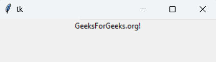
A window appears displaying the text “GeeksForGeeks.org!”.
****Explanation:**** label.pack() places the label inside the window.
> ****Note:**** Tkinter widgets support many options such as font, bg (background) and fg (foreground). Only a few commonly used options are shown in the examples.
### 2. Button
The Button widget is a clickable component used to perform an action when pressed, such as submitting data or closing a window. Below is the syntax:
> button = tk.Button(master, option=value)
****Example:**** This example creates a window titled “Counting Seconds” with a Stop button. When the button is clicked, the application closes.
`import tkinter as tk root = tk.Tk() root.title("Counting Seconds") button = tk.Button(root, text="Stop", width=25, command=root.destroy) button.pack() root.mainloop()`
****Output****
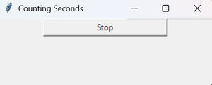
A window with a Stop button is displayed. Clicking the button closes the window.
****Explanation:****
- tk.Button(): Creates a button widget.
- command=root.destroy: Closes the application when the button is clicked.
- button.pack(): Places the button in the window.
### 3. Entry
The Entry widget is used to accept single-line text input from the user. For multi-line text input, the Text widget is used instead. Below is the syntax:
> entry = tk.Entry(master, option=value)
****Example:**** This example creates a simple form with First Name and Last Name input fields. The grid() geometry manager is used to arrange labels and entry boxes in a table-like layout.
`import tkinter as tk root = tk.Tk() tk.Label(root, text="First Name").grid(row=0, column=0) tk.Label(root, text="Last Name").grid(row=1, column=0) entry1 = tk.Entry(root) entry2 = tk.Entry(root) entry1.grid(row=0, column=1) entry2.grid(row=1, column=1) root.mainloop()`
****Output****
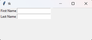
A window appears with two labeled text fields for First Name and Last Name.
****Explanation:****
- tk.Entry(): Creates a single-line text input box.
- grid(): Arranges widgets in rows and columns.
### 4. CheckButton
The Checkbutton widget is used to create a checkbox that can be toggled on or off. It is usually linked to a variable to store its current state. Below is the syntax:
> check = tk.Checkbutton(master, option=value)
****Example:**** This example creates a window with two checkboxes labeled Male and Female. Each checkbox is connected to an IntVar() that stores its state (1 for checked, 0 for unchecked).
`import tkinter as tk root = tk.Tk() var1 = tk.IntVar() var2 = tk.IntVar() tk.Checkbutton(root, text="Male", variable=var1).grid(row=0, sticky=tk.W) tk.Checkbutton(root, text="Female", variable=var2).grid(row=1, sticky=tk.W) root.mainloop()`
****Output****
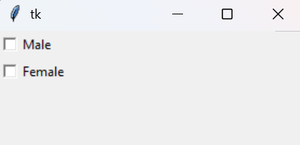
A window appears with two checkboxes arranged vertically.
****Explanation:****
- tk.IntVar(): Stores the checkbox state (1 or 0).
- grid(): Aligns widgets in rows and columns.
- sticky=tk.W: Aligns the checkbox to the left.
### 5. Radiobutton
The Radiobutton widget allows the user to select exactly one option from a group of choices. All radio buttons in a group share the same variable. Below is the syntax:
> radio = tk.Radiobutton(master, option=value)
****Example:**** This example creates two radio buttons labeled A and B. Only one option can be selected at a time.
`import tkinter as tk root = tk.Tk() v = tk.IntVar() tk.Radiobutton(root, text="A", variable=v, value=1).pack(anchor=tk.W) tk.Radiobutton(root, text="B", variable=v, value=2).pack(anchor=tk.W) root.mainloop()`
****Output****
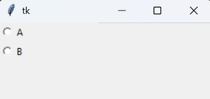
A window appears with two radio buttons. Selecting one automatically deselects the other.
****Explanation:****
- tk.Radiobutton(): Creates a radio button widget.
- tk.IntVar(): Stores the selected option value.
- value: Assigned value when the radio button is selected.
- anchor=tk.W: Aligns buttons to the left.
### 6. Listbox
The Listbox widget displays a list of items from which the user can select one or more options. Below is the syntax:
> listbox = tk.Listbox(master, option=value)
****Example:**** This example displays a list of programming languages using a Listbox.
`import tkinter as tk root = tk.Tk() lb = tk.Listbox(root) lb.insert(1, "Python") lb.insert(2, "Java") lb.insert(3, "C++") lb.insert(4, "Any other") lb.pack() root.mainloop()`
****Output****
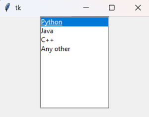
A window appears showing a list of programming languages.
****Explanation:****
- tk.Listbox(): Creates a list container.
- insert(): Adds items to the listbox.
- pack(): Displays the listbox in the window.
### 7. Scrollbar
The Scrollbar widget provides a scrolling mechanism for widgets such as Listbox, Text, or Canvas. It is used when the content is larger than the visible area. Below is the syntax:
> scrollbar = tk.Scrollbar(master, option=value)
****Example:**** This example creates a Listbox with 100 items and attaches a vertical scrollbar to it.
`import tkinter as tk root = tk.Tk() scrollbar = tk.Scrollbar(root) scrollbar.pack(side=tk.RIGHT, fill=tk.Y) mylist = tk.Listbox(root, yscrollcommand=scrollbar.set) for line in range(100): mylist.insert(tk.END, "This is line number " + str(line)) mylist.pack(side=tk.LEFT, fill=tk.BOTH) scrollbar.config(command=mylist.yview) root.mainloop()`
****Output****
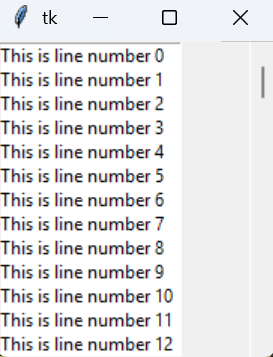
A window appears with a scrollable list containing 100 items.
****Explanation:****
- tk.Scrollbar(): Creates a vertical scrollbar.
- yscrollcommand=scrollbar.set: Connects the listbox to the scrollbar.
- scrollbar.config(command=mylist.yview): Enables scrolling behavior.
- pack(side, fill): Positions the widgets correctly.
### 8****. M****en****u****
The Menu widget is used to create menu bars and dropdown menus in a Tkinter application. Below is the syntax:
> menu = tk.Menu(master, option=value)
****Example:**** This example creates a menu bar with File and Help menus.
`import tkinter as tk root = tk.Tk() menu = tk.Menu(root) root.config(menu=menu) filemenu = tk.Menu(menu) menu.add_cascade(label="File", menu=filemenu) filemenu.add_command(label="New") filemenu.add_command(label="Open...") filemenu.add_separator() filemenu.add_command(label="Exit", command=root.quit) helpmenu = tk.Menu(menu) menu.add_cascade(label="Help", menu=helpmenu) helpmenu.add_command(label="About") root.mainloop()`
****Output****
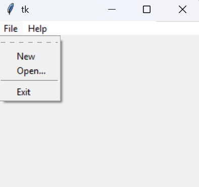
A window appears with a menu bar containing File and Help options.
****Explanation:****
- tk.Menu(): Creates a menu container.
- add_cascade(): Adds dropdown menus to the menu bar.
- add_command(): Adds menu items.
- add_separator(): Adds a dividing line.
- root.config(menu=menu): Attaches the menu bar to the window.
### 9. Combobox
The Combobox widget (from tkinter.ttk) provides a drop-down list that allows users to select one value from a predefined set of options. Below is the syntax:
> combo = ttk.Combobox(master, values=[...], state='readonly')
****Example:**** This program creates a dropdown menu and displays the selected option in a label.
`import tkinter as tk from tkinter import ttk def select(event): selected_item = combo_box.get() label.config(text="Selected Item: " + selected_item) root = tk.Tk() root.title("Combobox Example") label = tk.Label(root, text="Selected Item:") label.pack(pady=10) # Create a Combobox widget combo_box = ttk.Combobox( root, values=["Option 1", "Option 2", "Option 3"], state="readonly" ) combo_box.pack(pady=5) combo_box.set("Option 1") combo_box.bind("<<ComboboxSelected>>", select) root.mainloop()`
****Output****
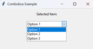
A window appears with a dropdown list.
### 10. Scale
The Scale widget provides a graphical slider that allows users to select a numeric value from a given range. Below is the syntax:
> scale = Scale(master, from_=min, to=max, orient=VERTICAL | HORIZONTAL)
****Example:**** This example creates both vertical and horizontal sliders.
`from tkinter import * master = Tk() # Vertical scale vertical_scale = Scale(master, from_=0, to=42) vertical_scale.pack() # Horizontal scale horizontal_scale = Scale(master, from_=0, to=200, orient=HORIZONTAL) horizontal_scale.pack() master.mainloop()`
****Output****
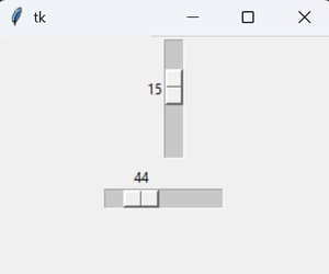
A window appears containing two sliders: one vertical and one horizontal.
****Explanation:****
- Scale(): Creates a slider widget.
- from_ / to: Defines the range of values.
- orient: Sets slider direction (VERTICAL or HORIZONTAL).
- pack(): Places the widget in the window.
### 11. TopLevel
The Toplevel widget is used to create a separate window in a Tkinter application. It is managed directly by the window manager and is commonly used for dialogs, pop-ups, or secondary windows. Below is the syntax:
> top = Toplevel(master, option=value)
****Example:**** This example creates a main window and a secondary window using Toplevel.
`from tkinter import * root = Tk() root.title('GfG') top = Toplevel() top.title('Python') top.mainloop()`
****Output****
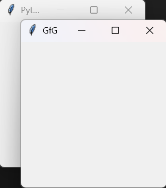
Two windows appear: Main window titled GfG and Secondary window titled Python
****Explanation:****
- Toplevel(): Creates a new independent window.
- title(): Sets the window title.
### 12. Message
The Message widget is used to display multi-line text with automatic word wrapping. It is useful for showing longer messages or descriptions in a formatted way.
> message = Message(master, option=value)
****Example:**** This example displays a text message with a colored background.
`from tkinter import * main = Tk() ourMessage = "This is our Message" messageVar = Message(main, text=ourMessage) messageVar.config(bg="lightgreen") messageVar.pack() main.mainloop()`
****Output****
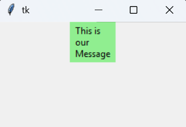
A window appears displaying a multi-line message with a light green background.
****Explanation:****
- Message(): Creates a message widget with word wrapping.
- text: Specifies the message to display.
- config(bg=...): Sets background color.
- pack(): Places the widget in the window.
### 13. MenuButton
The Menubutton widget is used to create a button with a dropdown menu. When clicked, it displays a menu containing different options such as commands or checkbuttons. Below is the syntax:
> menubutton = Menubutton(master, option=value)
****Example:**** This example creates a Menubutton labeled GfG that opens a dropdown menu with two checkbutton options.
`from tkinter import * top = Tk() mb = Menubutton ( top, text = "GfG") mb.grid() mb.menu = Menu ( mb, tearoff = 0 ) mb["menu"] = mb.menu cVar = IntVar() aVar = IntVar() mb.menu.add_checkbutton ( label ='Contact', variable = cVar ) mb.menu.add_checkbutton ( label = 'About', variable = aVar ) mb.pack() top.mainloop()`
****Output****
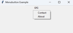
A window appears with a Menubutton labeled GfG.
****Explanation:****
- Menubutton(): Creates a button with an attached menu.
- Menu(): Defines the dropdown menu.
- add_checkbutton(): Adds toggleable options to the menu.
- IntVar(): Stores the checked/unchecked state.
### 14. Progressbar
The Progressbar widget is used to show the progress of a long-running task, such as file downloads or data processing. Below is the syntax:
> Progressbar(parent, orient, length, mode)
****Example:**** This example simulates a task by gradually filling the progress bar from 0% to 100% when a button is clicked.
`import tkinter as tk from tkinter import ttk import time def start_progress(): progress.start() # Simulate a task that takes time to complete for i in range(101): # Simulate some work time.sleep(0.05) progress['value'] = i # Update the GUI root.update_idletasks() progress.stop() root = tk.Tk() root.title("Progressbar Example") # Create a progressbar widget progress = ttk.Progressbar(root, orient="horizontal", length=300, mode="determinate") progress.pack(pady=20) # Button to start progress start_button = tk.Button(root, text="Start Progress", command=start_progress) start_button.pack(pady=10) root.mainloop()`
****Output:****

A progress bar gradually fills from 0% to 100% when the button is clicked.
### 15. SpinBox
The Spinbox widget is an enhanced Entry widget that allows users to select a value from a fixed range using up and down arrows. Below is the syntax:
> spinbox = Spinbox(master, option=value)
****Example:**** This example creates a Spinbox that allows selecting numbers from 0 to 10.
`from tkinter import * root = Tk() root.title("Spinbox Example") spinbox = Spinbox(root, from_=0, to=10) spinbox.pack() root.mainloop()`
****Output****
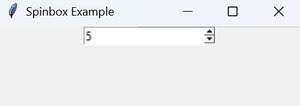
A window appears with a Spinbox that lets the user select numbers using arrow buttons.
****Explanation:****
- Spinbox(): Creates a numeric input field with increment/decrement arrows.
- from_ / to: Defines the allowed range.
- pack(): Places the widget in the window.